AECC
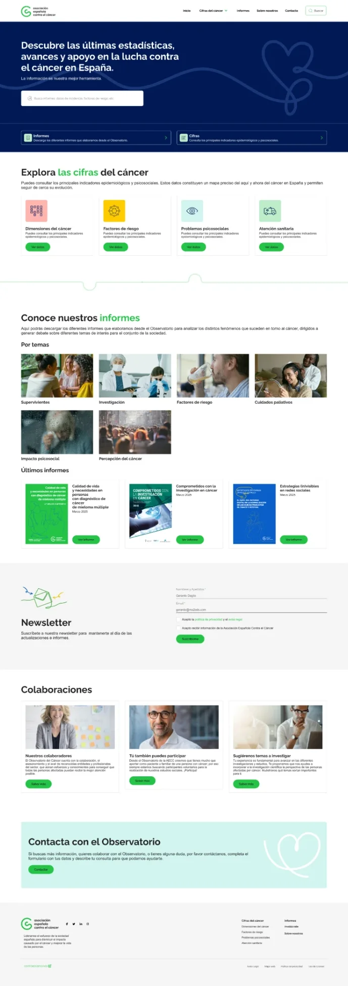
The El Observatorio website, adapted so its real users find the information they are looking for more easily.

Redefining the visual ecosystem of “El Observatorio”
The Asociación Española Contra el Cáncer (AECC) was carrying out an in-depth analysis of its whole digital ecosystem. Within that framework, we were asked to audit the “El Observatorio” website and propose strategic improvements, focusing on data visualisation and user engagement. It is a website with a great deal of information, and the challenge was to let anyone who arrives find what they are looking for quickly.
Design team manager
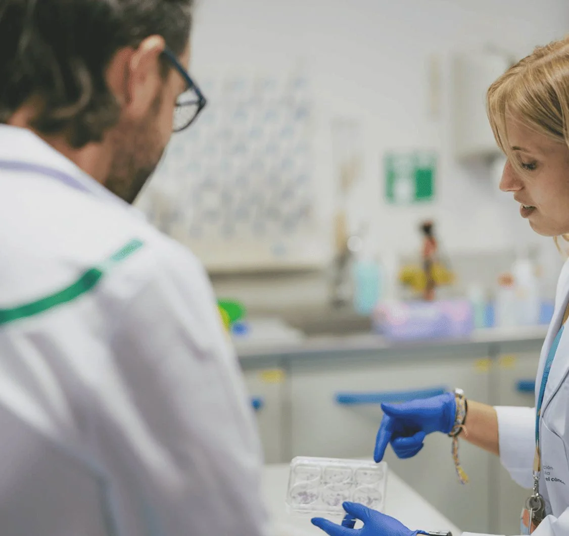
As Design Manager I led a team of two people, myself included, in a role that combined management with research and UX and UI design. Over the six months of the project, my job was to plan each phase of the research, turn the findings into design decisions and keep the project aligned with what the AECC needed.
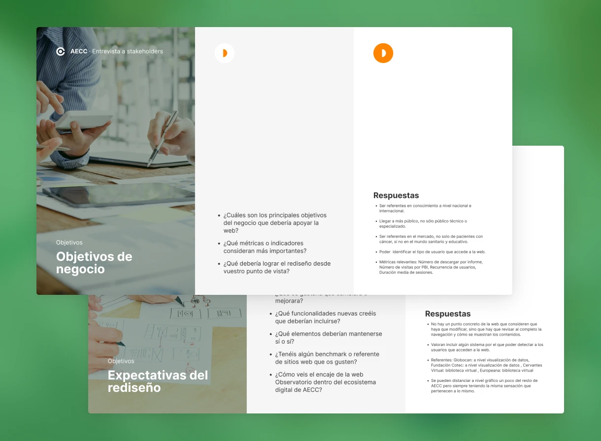
Stakeholder interviews
We interviewed all the key stakeholders at “El Observatorio” to understand the needs of every party involved and identify possible technical and operational constraints. We understood that what the AECC needed was to adapt the website so its users could consume the information faster and more effectively. That shaped every following phase of the design.
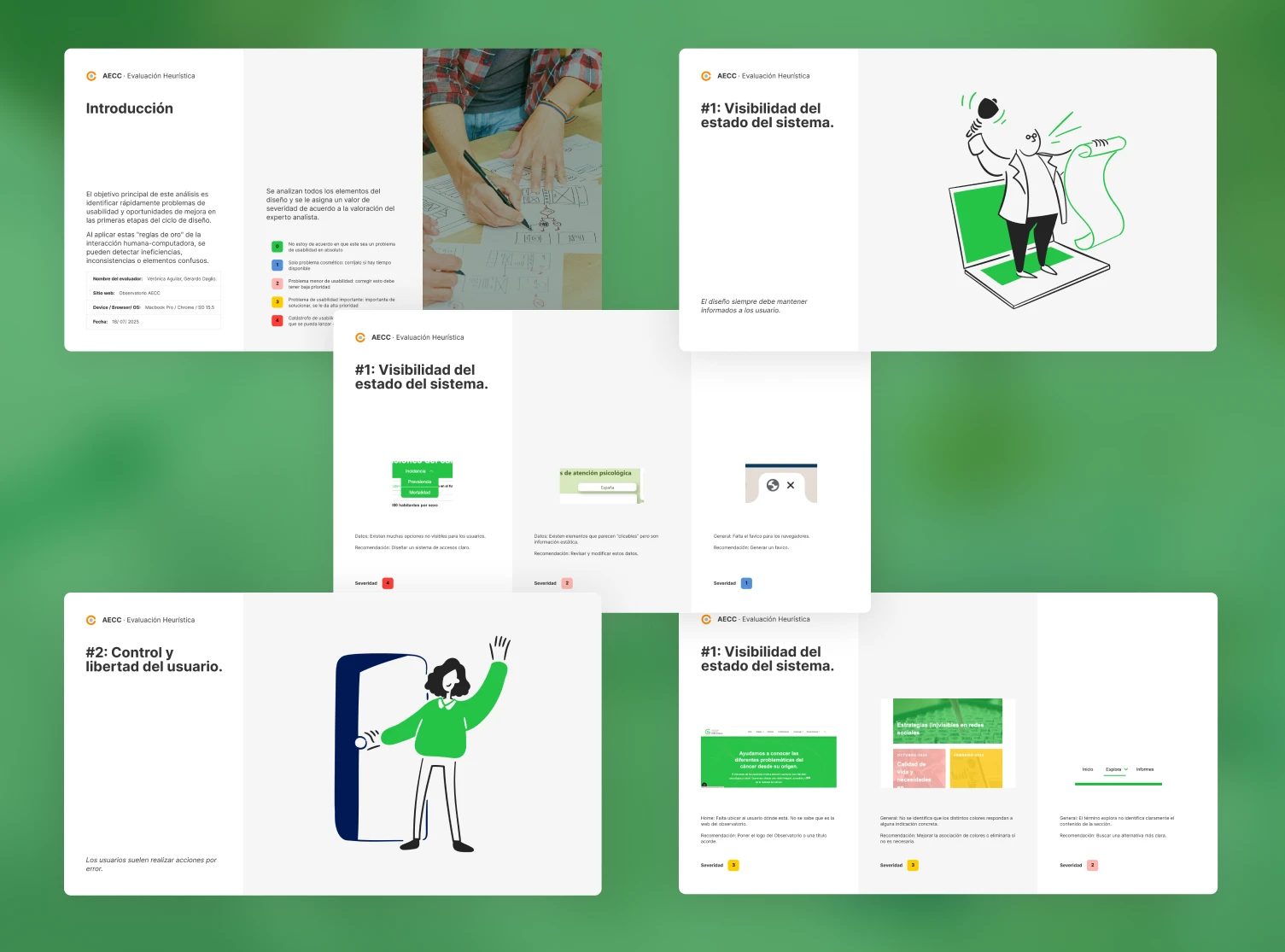
Heuristic evaluation
After the stakeholder interviews, we carried out a heuristic evaluation to contrast the business requirements with the site's actual performance. This dual approach let us pinpoint exactly where the platform was failing its users.
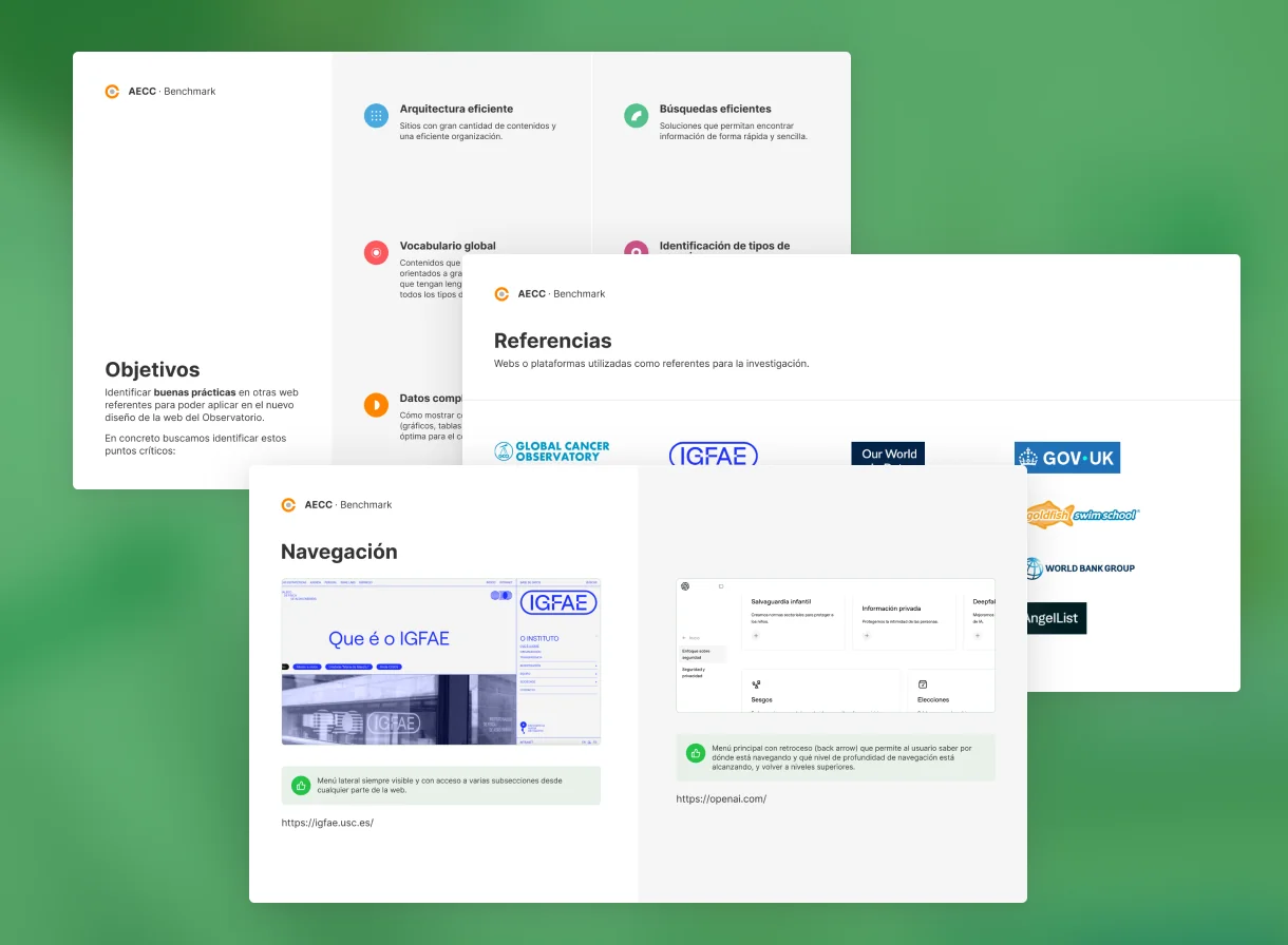
Benchmark
We ran a competitive benchmark to analyse how leading data platforms handle high-density information. We identified three keys: information filters, advanced search and a correct categorisation of content.
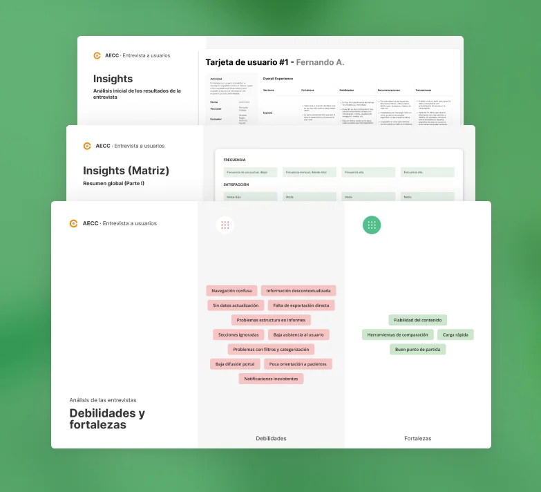
User interviews
We held a series of user interviews to learn first-hand how researchers and the general public used the platform, which let us empathise with their pain points and understand the specific contexts in which they consume scientific data.
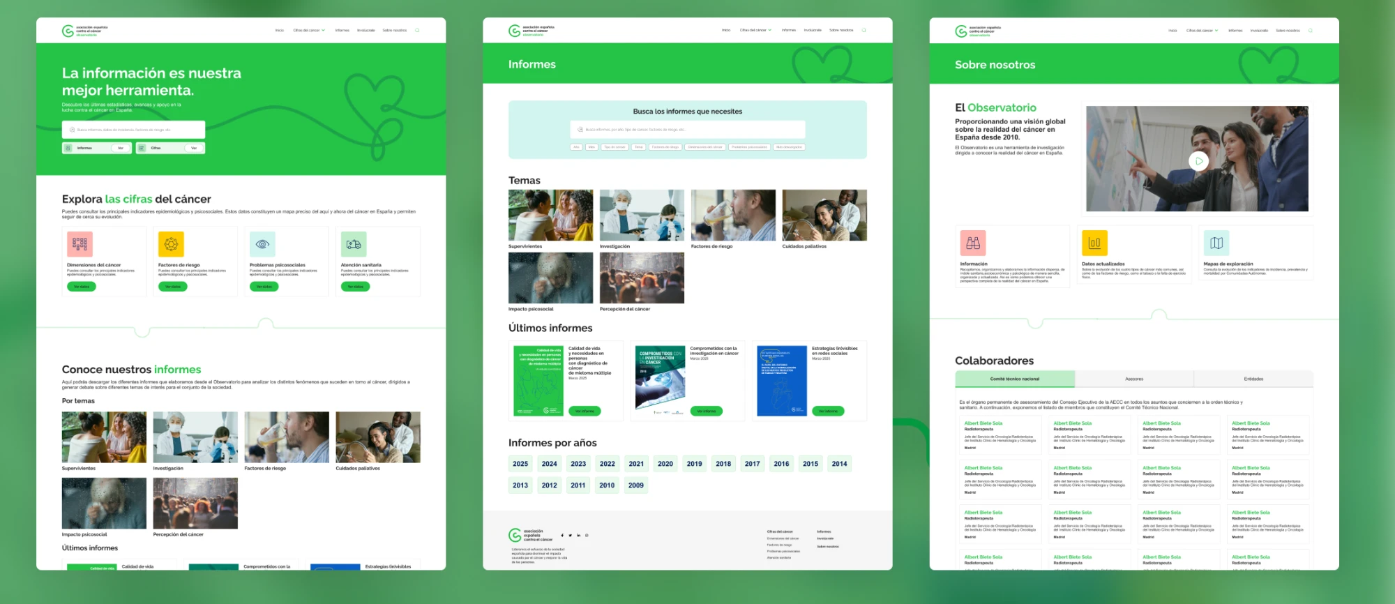
First proposal
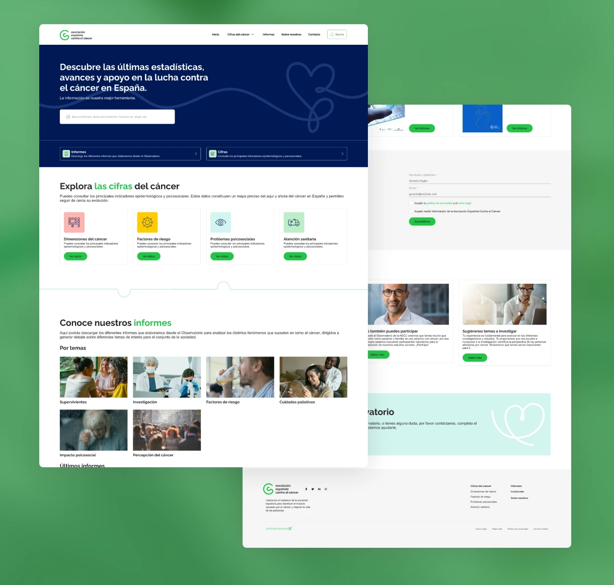
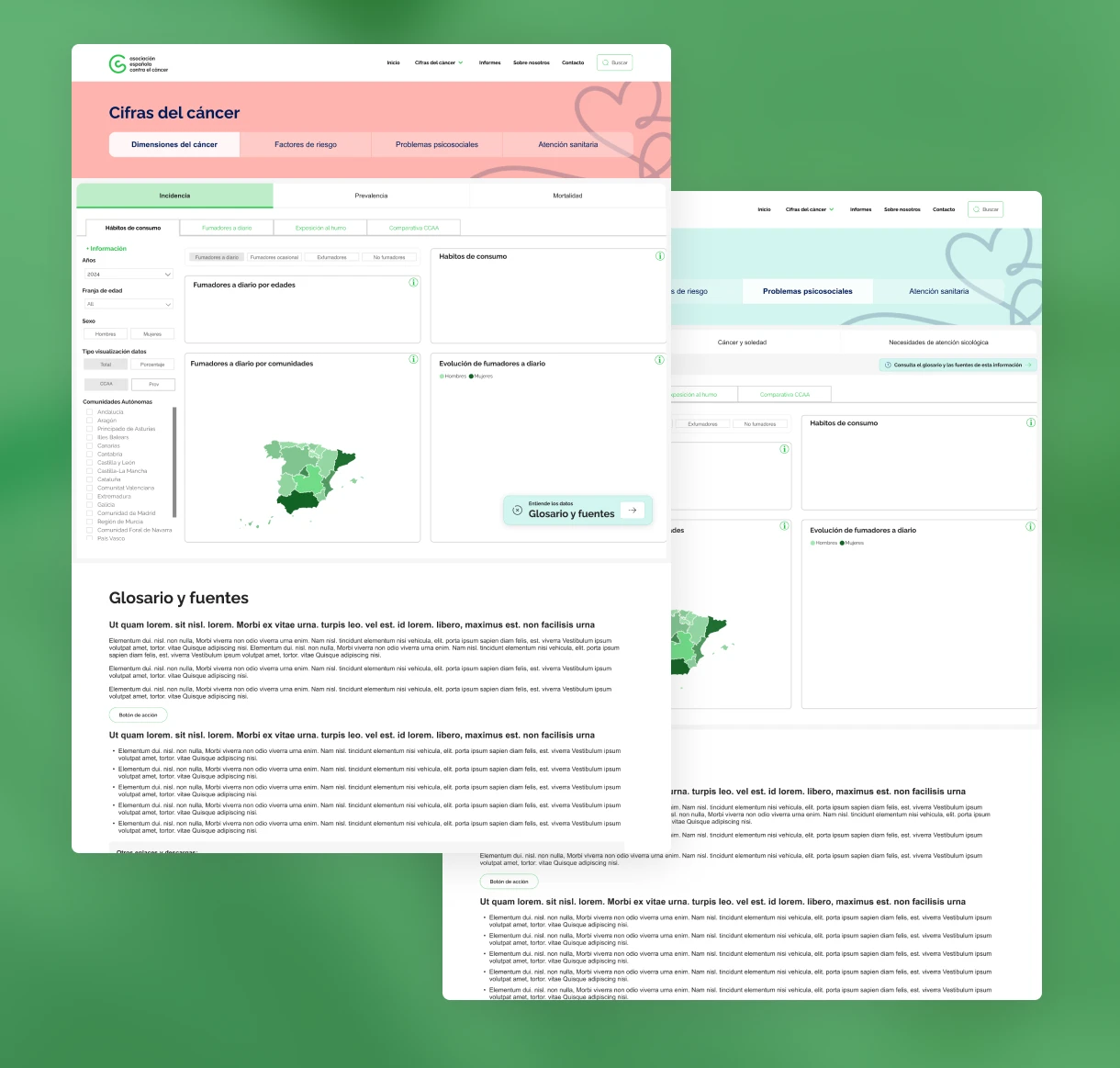
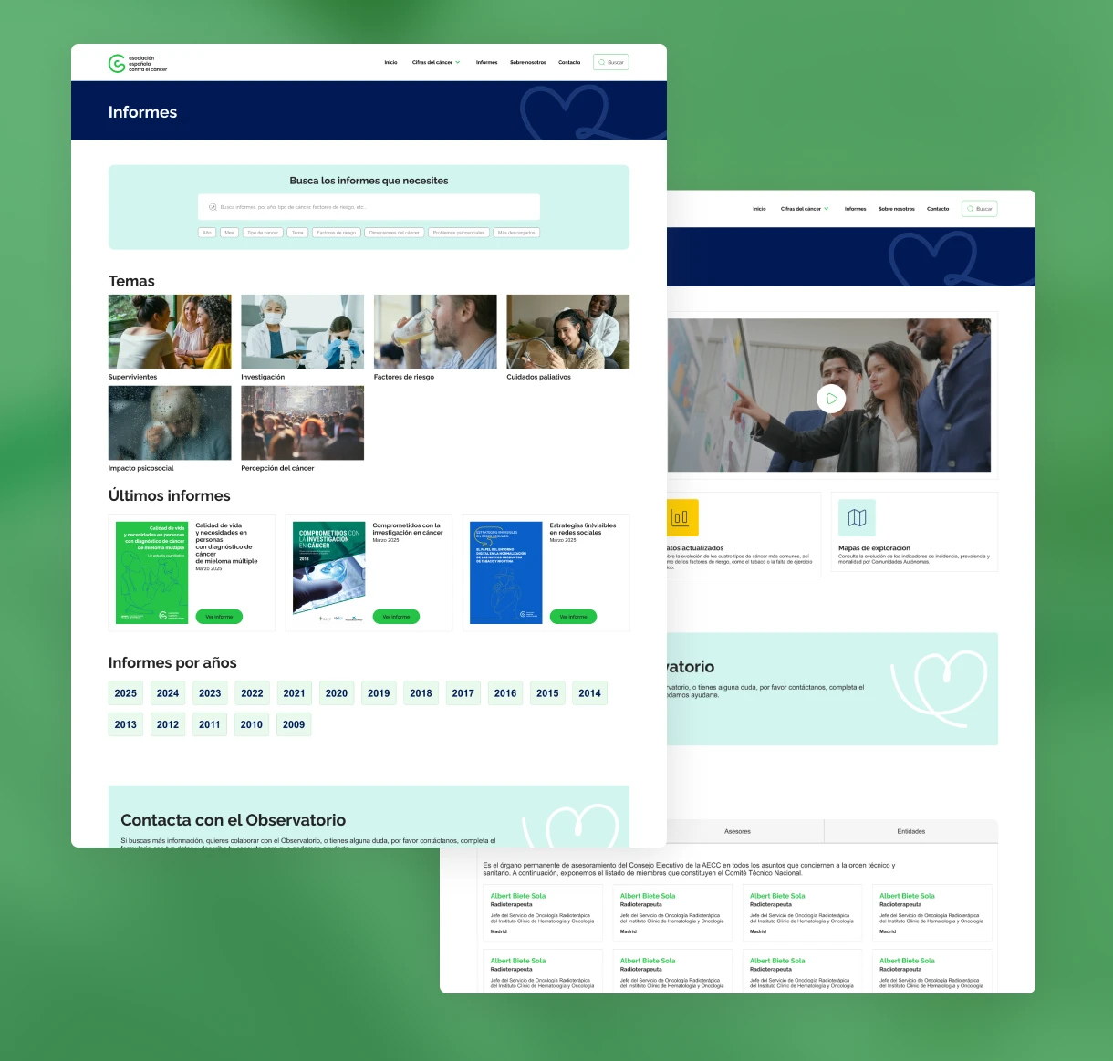
With all the insights gathered, we fully redesigned the platform. We developed a cohesive UI kit and adapted the components to ensure consistency, accessibility and a smooth experience across every data-heavy section.
Tests with users
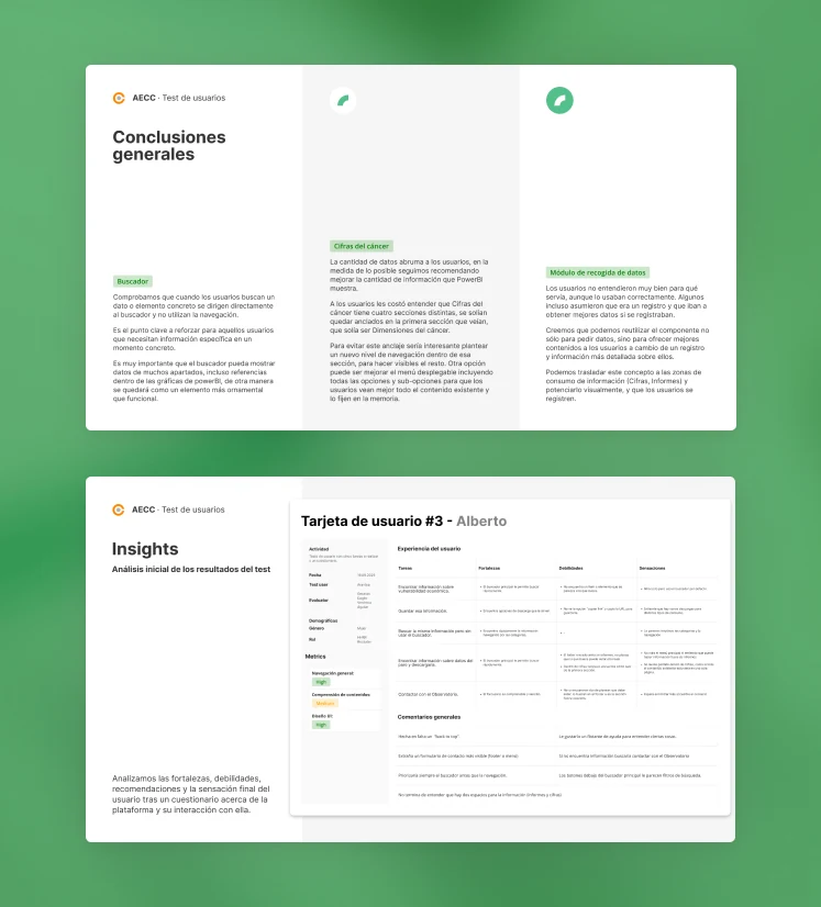
We ran usability tests with 6 representative users to validate the new designs and identify what to improve. Based on the results, we adjusted the advanced search to add filters and strengthened the separation of content into clearer blocks.
Final solution
After analysing the data from the test sessions, we implemented a series of improvements to refine the experience, making sure the final interface solved the usability problems found during the research.
What we achieved
- A website adapted to its real users, who find the information they are looking for more easily.
- An advanced search with filters and content organised into clearer blocks, validated with users.
- Design decisions grounded in research: stakeholders, heuristic evaluation, benchmark, interviews and tests with 6 users.