Adeslas
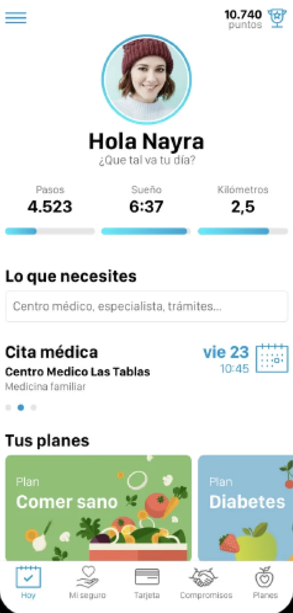
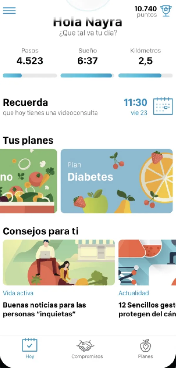
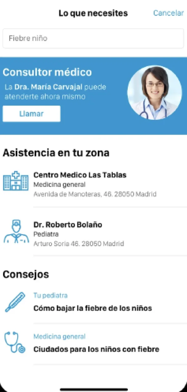
Adeslas' health platform, renewed and launched on app and web, with users who come back more often.

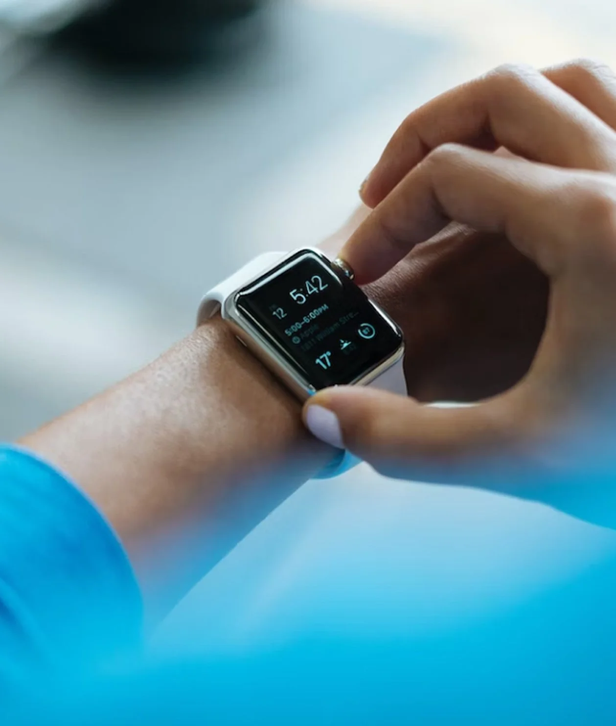
Helping users take better care of their health through the app
Guided by customer care, Adeslas' Health and Wellbeing service offered health plans on a web platform. Adeslas wanted its customers to use it more, to help them adopt healthier habits and prevent illness. Our mission was to redesign the user flows and the look and feel, bring them to a mobile app and improve the experience across every channel, so that users would take control of their health and their bond with the brand would grow stronger.

Design team manager
As Design Manager I led a team of six people, myself included, with UX/UI, research and design system specialist profiles, in a role that combined managing the team with research and UX and UI design. Over the year and a half of the project, my job was to coordinate the team across the app and the website, and to keep the design aligned with Adeslas' goals.
Heuristic and usability analysis of the platform
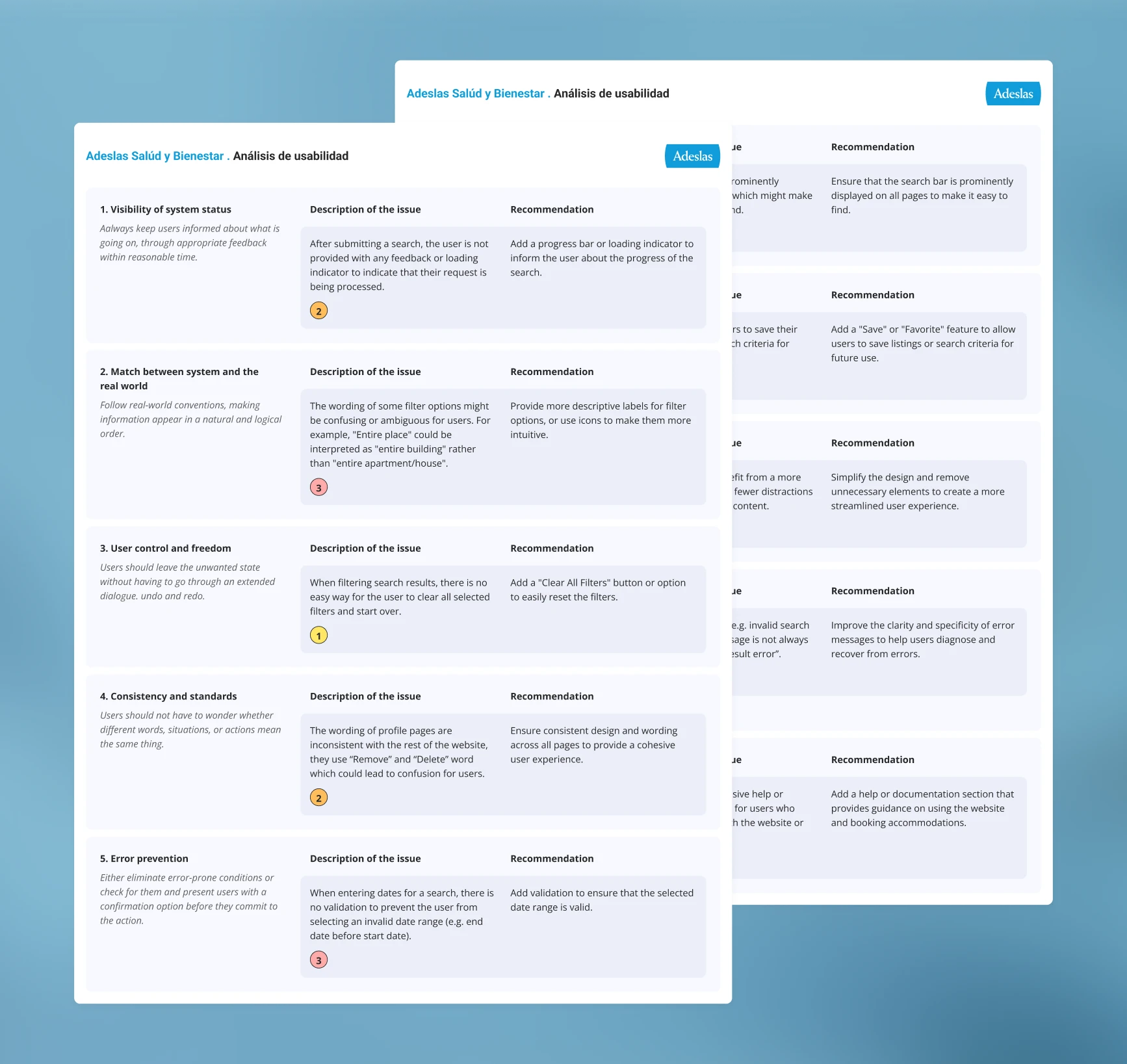
We started by analysing the existing platform to identify its strengths and weaknesses in both design and performance. We found three main problems: badly organised, mixed-up content, no clear levels of navigation and no consistency in colours, sizes or language. Together with the requirements gathering, these findings laid the foundation of our design strategy and helped us prioritise the areas with the greatest impact.
A scalable UI kit to ensure visual consistency
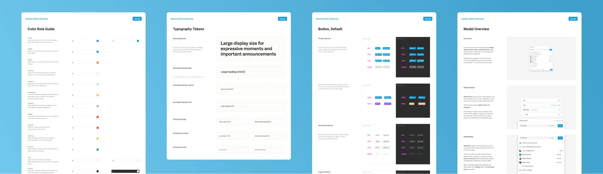
Building on Adeslas' style guides and design system, we developed a visual system tailored to the specific needs of the platform's different features. This UI kit worked alongside the brand's global design system, with every style harmonised so that users always felt within the Adeslas ecosystem. Adeslas' system did not cover some of the platform's cases, so we made adaptations and documented them for Adeslas to decide whether to add them to its global design system.
Designing the app and the website
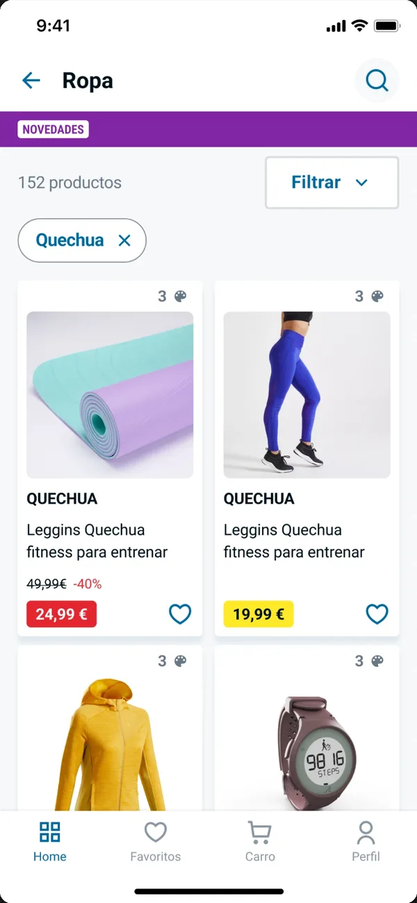
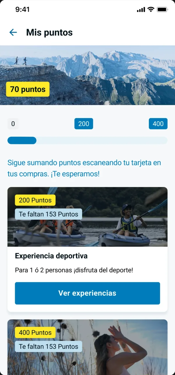
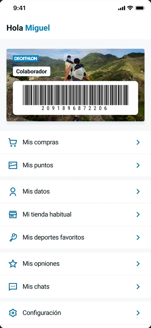
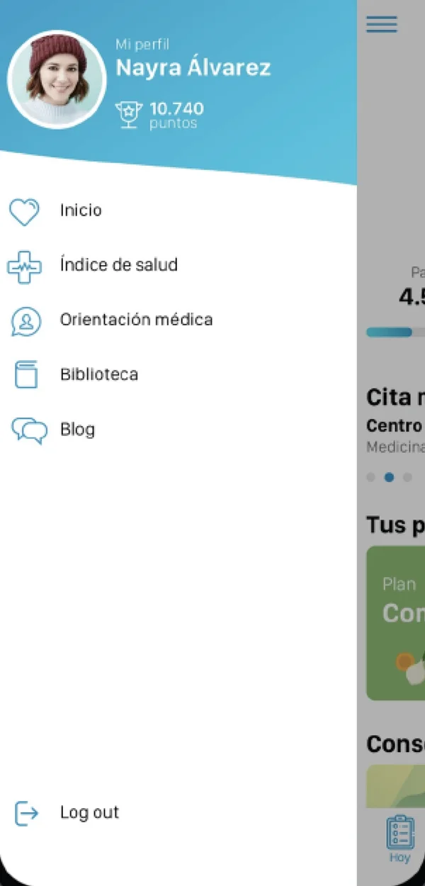
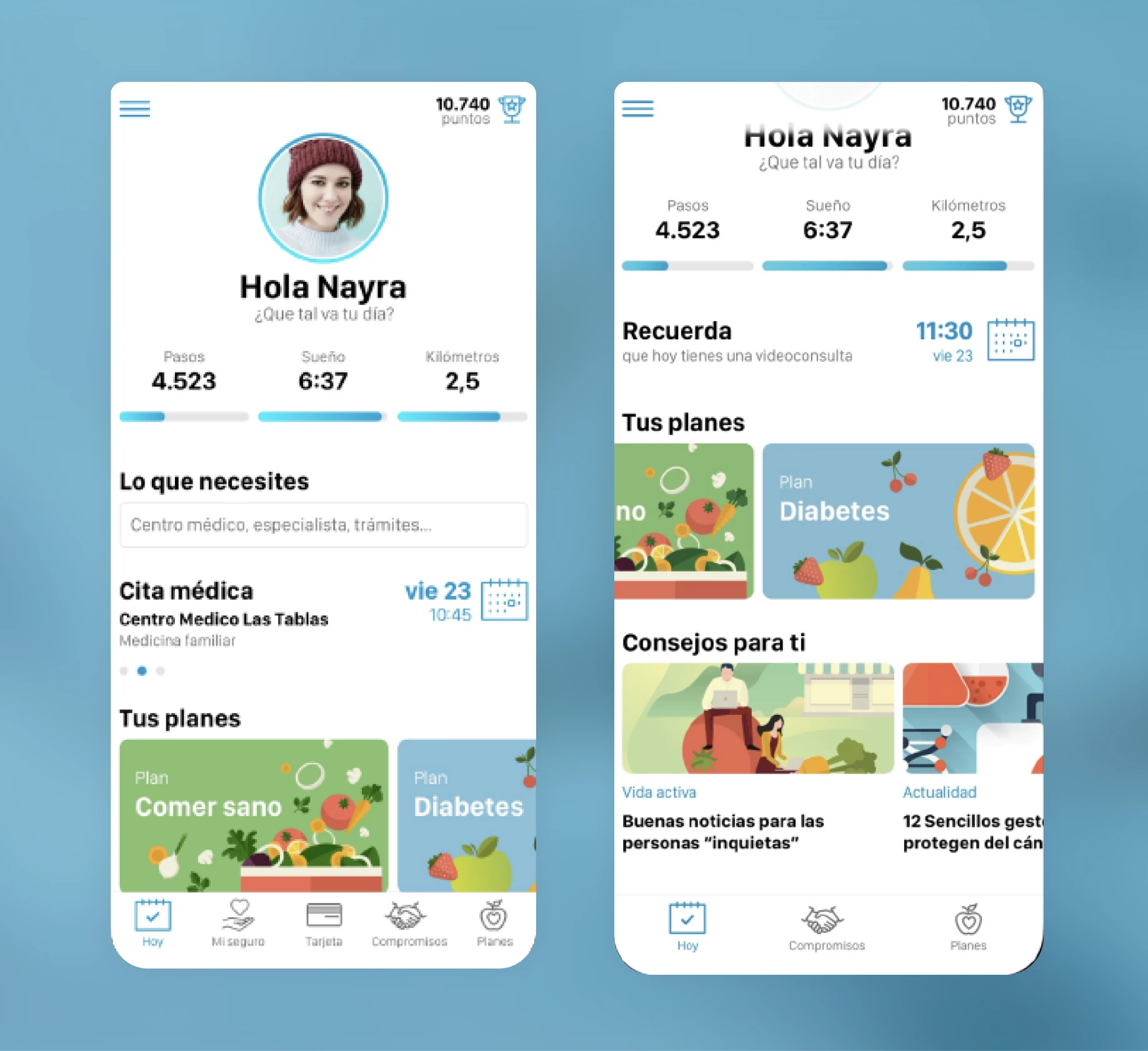
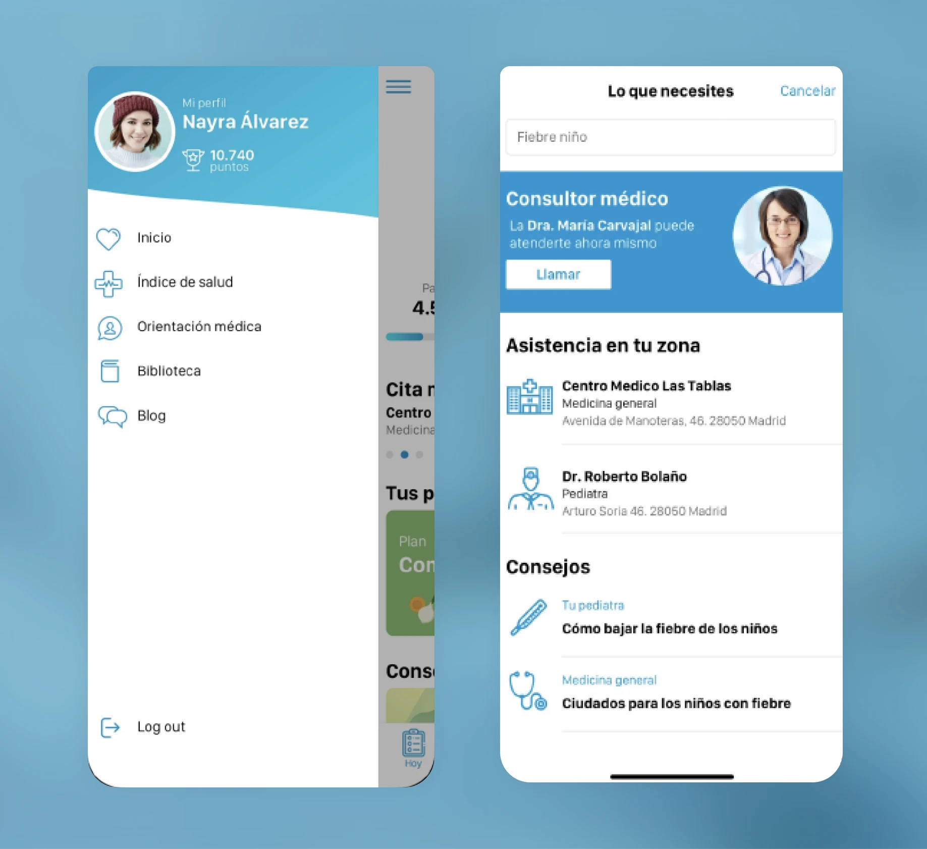
We designed the entire app and website using the component library we had built. We focused on organising the content and creating clear levels of navigation, the two big problems the audit had found.
Validating the implemented design
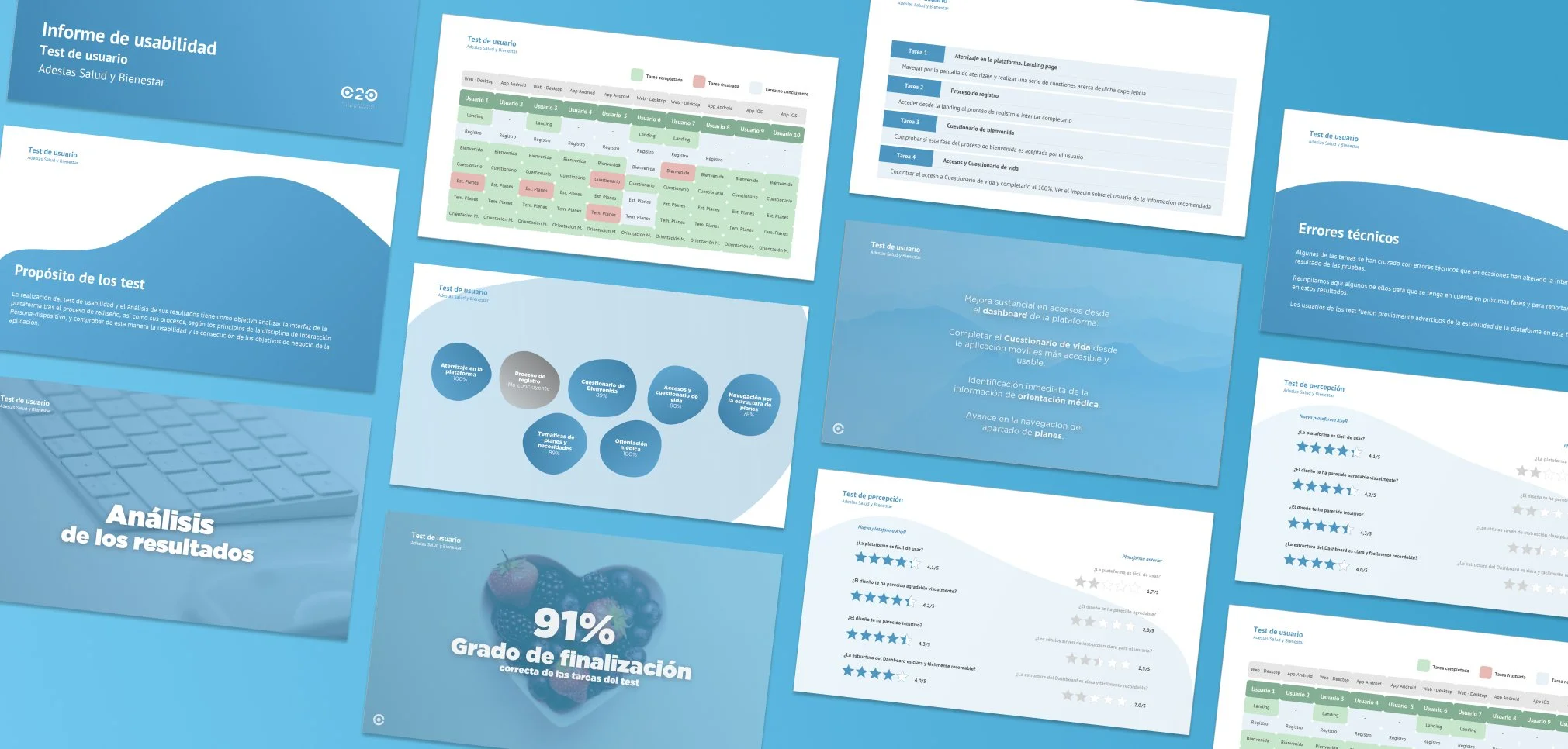
As features were released, we ran tests with 10 users to check whether the solutions met their needs and to spot friction points. Based on the results, we changed the main navigation menu to better organise the content blocks. We documented the findings in a detailed report and iterated on the design to keep improving the experience.
What we achieved
- An updated, improved interface across the whole platform.
- The platform, launched on app and web.
- Users coming back more often.