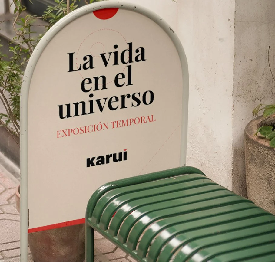
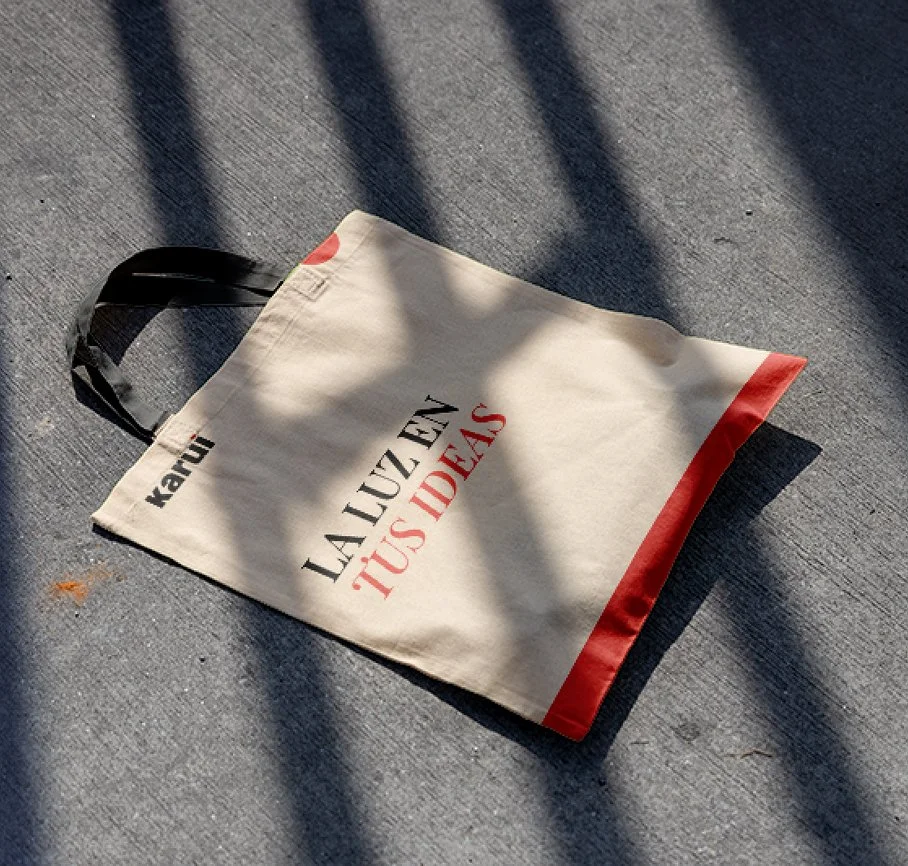
Karui
Updating the brand image with a modern, professional approach
Karui needed to update its brand image. The brief was to let it present itself as a professional company, without losing its closeness to clients, its ability to adapt to their needs, and its role accompanying them at their events.


The four pillars behind the brand
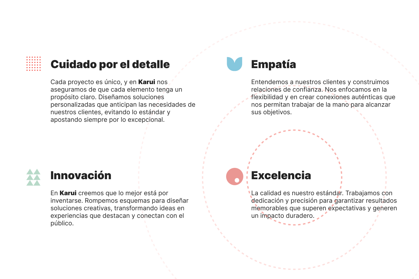
We interviewed the partners and ran a workshop to define the values Karui identified with, which would guide the whole visual identity.
The sun, the light, the brand
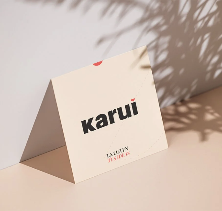
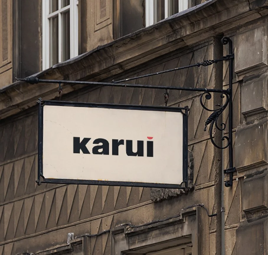
Karui's logo is a minimalist, modern visual representation of the brand's values: calm, clarity and distinctiveness. Set in lowercase type, the logo projects closeness and accessibility, while a robust typeface gives it strength and professionalism.
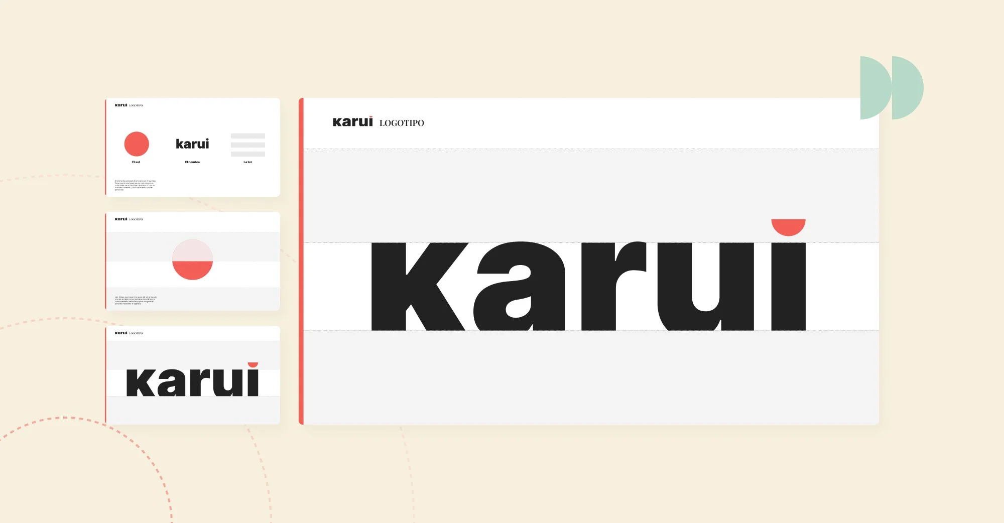
The idea in execution
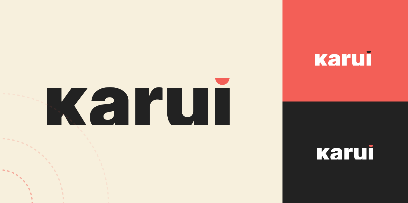
The logo is the brand’s most representative element. It always holds a prominent place across products, campaigns and communications, conveying trust and solidity in every interaction.
Visual universe
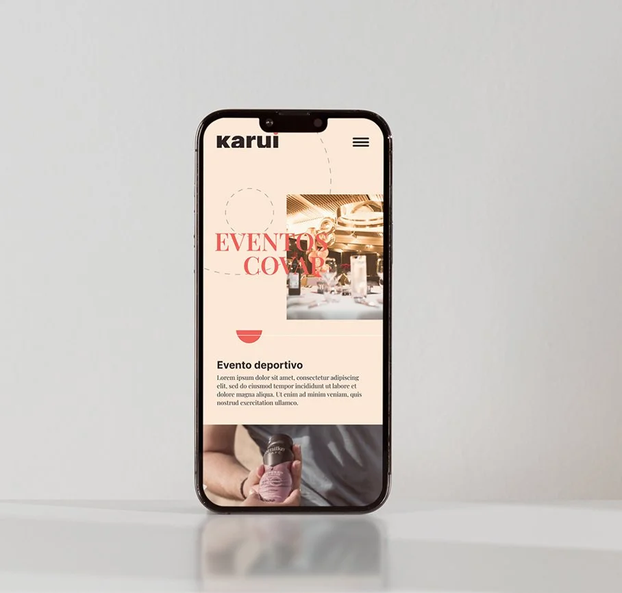
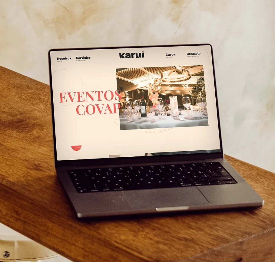
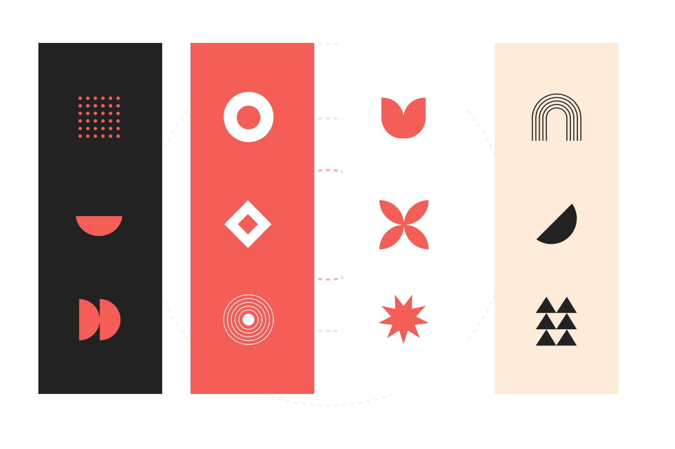
Alongside the logo, we developed a set of visual elements drawing on the same references explored in the concept phase: the straight lines of light, the curve of the sun, and more.

Brand rollout